Chexy is a platform that currently allows users to pay rent with their credit cards and receive cashback rewards for making rent payments. In addition, the platform allows users to build credit without having to take on additional debt when rent payments usually take up the majority of pay cheques.
Chexy's rent payment feature is a valuable tool for users, but the existing status bar lacks clarity and scalability across devices. This case study details the redesign of the rent payment status bar, focusing on a mobile-first approach to improve user experience, streamline information, and guide users through the payment lifecycle.
January 3rd, 2024|Fintech
Chexy Status Indicator Bar
Streamlining the Chexy Rent Payment Status Bar for improved user experience and mobile usability
Company
Chexy
Timeline
December 2023 - January 2024
Role
Product Designer
Status
Shipped & Live
About The Project
User Research & Pain Points
Information Overload
Too much information is presented upfront, overwhelming users.
Mobile Usability
The component is too large and cumbersome on mobile screens.
Timeline Ambiguity
The period between "Landlord deposited rent" and the "next charge day" is unclear.
Design Goals
The primary goal was to streamline the payment status bar to improve visibility and interactivity on mobile devices. The redesign focused on prioritizing the display of the current step in the payment process, providing easy access to transaction history, offering a collapsible view for upcoming payment steps, and clearly indicating the payment status. These elements were critical in addressing user needs for simplicity and clarity, ensuring the status bar effectively communicated essential information without overwhelming the user.
Prioritize Clarity: Focus on displaying the current/next step prominently, collapsing additional details.
Mobile First: Ensure a compact and responsive design for mobile devices.
Clarify Timeline: Clearly illustrate the status and timeline between key payment milestones
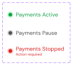
Clear and comprehensive payment states are crucial for a successful user experience within the Chexy platform. These states provide users with real-time transparency into their payment status, fostering trust and confidence in the system. By detailing each step of the payment process, from initial scheduling to final deposit, users are empowered with the information they need to proactively manage their finances and avoid late fees or missed payments. Additionally, the inclusion of "Payment failed" and "Account not active" states, along with clear calls to action, guide users towards resolving issues promptly, ensuring uninterrupted service and a positive overall experience. This level of detail and guidance is essential for a payment platform, as it directly impacts the financial well-being of both tenants and landlords.
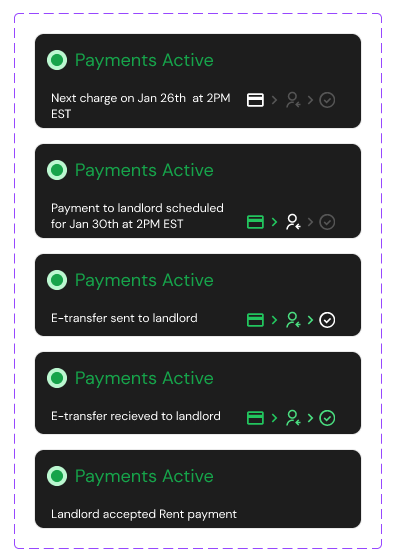
Payments Active
a. [Before next charge day] lead up to next payment.
b. Payment successful > payment to landlord scheduled for 4 business If payment fails, action is required (we’ll have a CTA to make a one time payment). This will be its own state.
c. Payment to landlord has gone out. if Payments go out at 2PM EST. Let the user know.
d. Landlord has received their e-transfer.
e. Landlord has deposited their e-transfer.
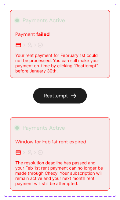
Payments Failed
a. CTA to resolve payment within 24hours.
b. More than 24hours (outside resolution window) copy indicating that payment has failed and can no longer be made through Chexy (ie. it’s too late figure out another way to pay your landlord)i.
Subscription remains active, however. So even though this payment can no longer be made, next month’s payment will still be scheduled and attempted.
Account not active
a. CTA to reactivate account (show that no payments are currently scheduled).
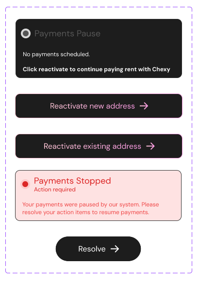
"Skipped Month"
Design Process
The redesign process involved creating high-fidelity mockups in Figma, which detailed various user states and screen sizes. These designs were then transformed into interactive prototypes, allowing us to conduct robust user testing. Feedback gathered during these sessions was instrumental in refining the design, ensuring it not only met but exceeded user expectations. This iterative process was crucial in validating our design choices and making necessary adjustments based on direct user insights.
1. Information Architecture:
2. Wireframes & Prototypes:
Explored multiple design iterations, focusing on mobile-first layouts.Developed interactive prototypes to test user flows and gather feedback.
3. Visual Design:
Integrated Chexy's design language and color palette.Designed clear icons and visual cues for payment status.Optimized typography for readability across devices.
1. Information Architecture:
- Streamlined payment states to prioritize current status and next steps.
- Grouped related states for better organization. Created a visual timeline/flowchart to illustrate state transitions.
2. Wireframes & Prototypes:
Explored multiple design iterations, focusing on mobile-first layouts.Developed interactive prototypes to test user flows and gather feedback.3. Visual Design:
Integrated Chexy's design language and color palette.Designed clear icons and visual cues for payment status.Optimized typography for readability across devices.
User Testing & Validation
Task Completion Time: Users were able to understand their payment status and complete tasks more quickly.
User Satisfaction: Users reported higher satisfaction with the clarity and ease of use.
Mobile Experience: The redesigned component was well-received on mobile devices.
Engagement:Increased user engagement with the rent payment feature.
Support Inquiries:Reduced support inquiries related to payment confusion.
Payment Success Rate:Improved success rate for on-time rent payments.
Key Learnings
This project reinforced the importance of a mobile-first design approach to ensure optimal usability across various devices, especially given the intricate user flows and numerous edge cases inherent to rent payment systems. The careful prioritization of information and strategic use of visual cues, such as timelines and icons, proved essential in simplifying complex processes and guiding users through their rent payment journey.
The iterative design process, incorporating user feedback at multiple stages, was instrumental in refining the solution and validating its effectiveness. Additionally, the emphasis on data-driven decision-making, through the tracking of relevant metrics and subsequent A/B testing against the current design, will be crucial for measuring the impact of the redesign and informing future iterations.
The iterative design process, incorporating user feedback at multiple stages, was instrumental in refining the solution and validating its effectiveness. Additionally, the emphasis on data-driven decision-making, through the tracking of relevant metrics and subsequent A/B testing against the current design, will be crucial for measuring the impact of the redesign and informing future iterations.